SIG
Brand Identity & Packaging DesignINSTRUCTOR: Gerardo Herrera & Jini Zopf
GROUP MEMBERS: Iris Cheng, Titi Wu, Cynthia Qin, Jason Li & Levina Lasmana
SYSTEMATIC EXTENTION
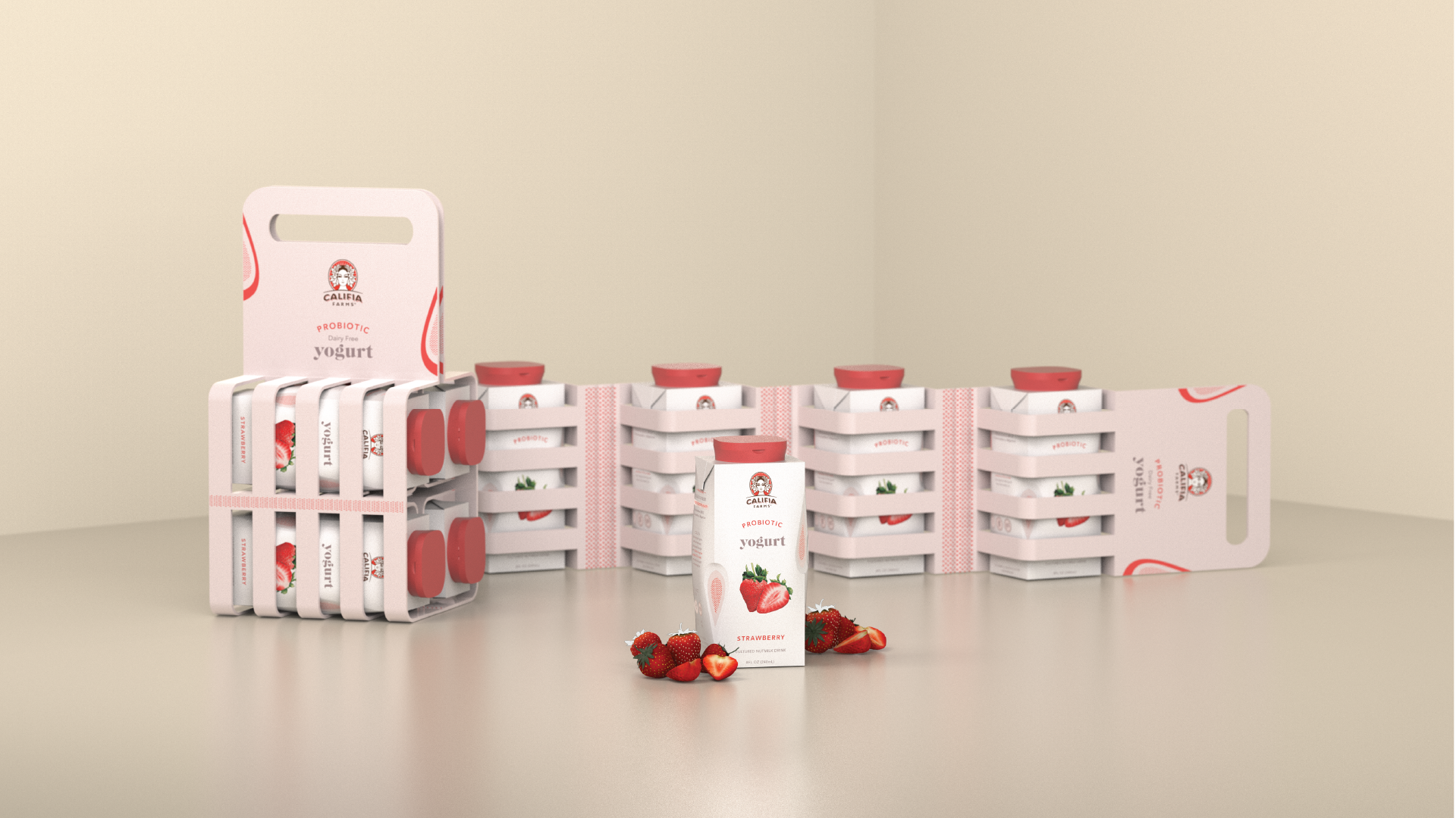
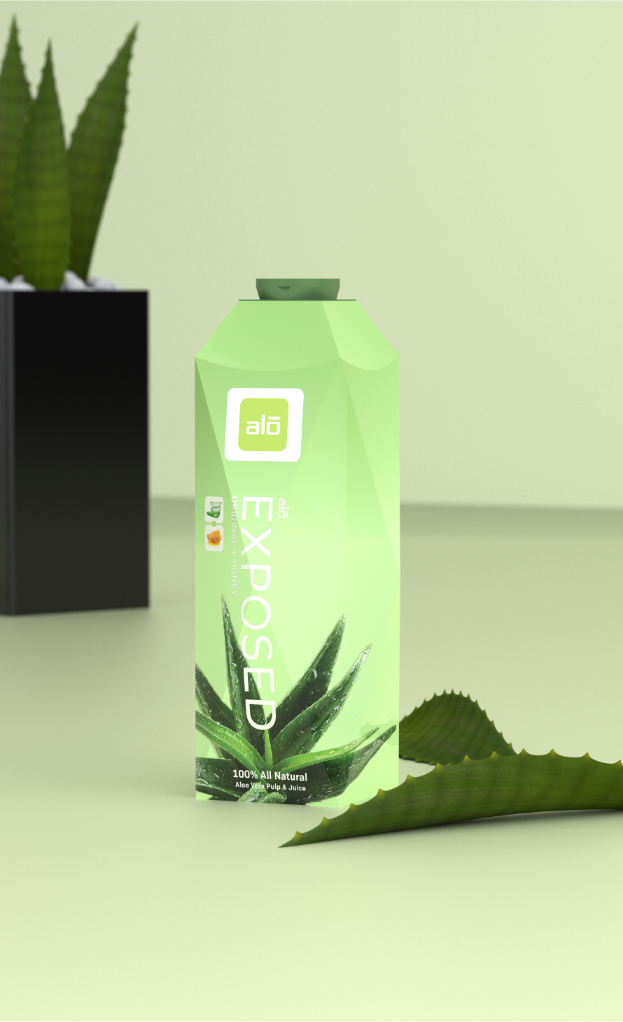
A group transdisciplinary project sponsored by the beverage company SIG. As one of the leading brand in providing aseptic packaging, the challenge for the design team was to create a versions of aseptic packaging that prioritizes user experience. Versioning not only limited to the primary package, but also includes coming up with different types of openings (lids) and multipacks (secondary packaging). Took the opportunity of creating a more cohesive brand identity system for SIG to apply to their wide range of products and services. Since SIG operates as B2B, applying graphics of existing brands to convince SIG’s clients. 
Developing a consistent brand language unique to SIG that sets them apart from their competitors. Portraying SIG’s precise, clean and forward-thinking characteristics through repititive delicate lines while highlighting the uniqueness of each forms with SIG’s signature blue color.
OPENINGS
Designing various types of closure for easier grip, faster opening, leak proof, and controlled dosage pouring.


CLIP TIP
Designed for easier grip and opening with secure seal to prevent spillage.
![]()
Designed for easier grip and opening with secure seal to prevent spillage.

PUSH POP
For products that needs controlled dosage pouring and easy access of opening.
![]()
For products that needs controlled dosage pouring and easy access of opening.

PUSH-TWIST POP
Designed to be placed on center of package for all-direction pouring and prevent leakage.
![]()
Designed to be placed on center of package for all-direction pouring and prevent leakage.

VERSIONING
Designing innovative forms to increase shelf impact and apply unique graphic applications. Challenged to create forms that can be manufactured on SIG’s machines that requires square dielines. Staying consistent with SIG’s naming system by using “Combi” for each form, and adding numbering system to decrease the risk of miscommunication.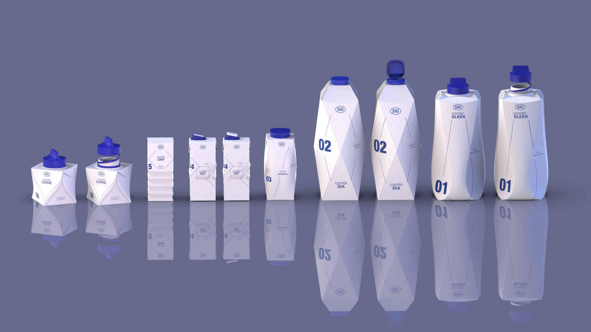
COMBI SLEEK
Designed to hold even family size packages with the perfect grip, preventing chances of over-pouring and spillage.
![]()
![]()
![]()
Designed to hold even family size packages with the perfect grip, preventing chances of over-pouring and spillage.


COMBI DIA
Designed for distinct shelf appearance. Compatible with SIG’s filling machine. Perfect for products that contains chunks.
![]()
![]()
![]()
Designed for distinct shelf appearance. Compatible with SIG’s filling machine. Perfect for products that contains chunks.


COMBI DOUBLE
Designed with subtle dents at the edges for better finger placement and intuitive grip. Soft edges highlights elegance of the form.
![]()
![]()
![]()
Designed with subtle dents at the edges for better finger placement and intuitive grip. Soft edges highlights elegance of the form.
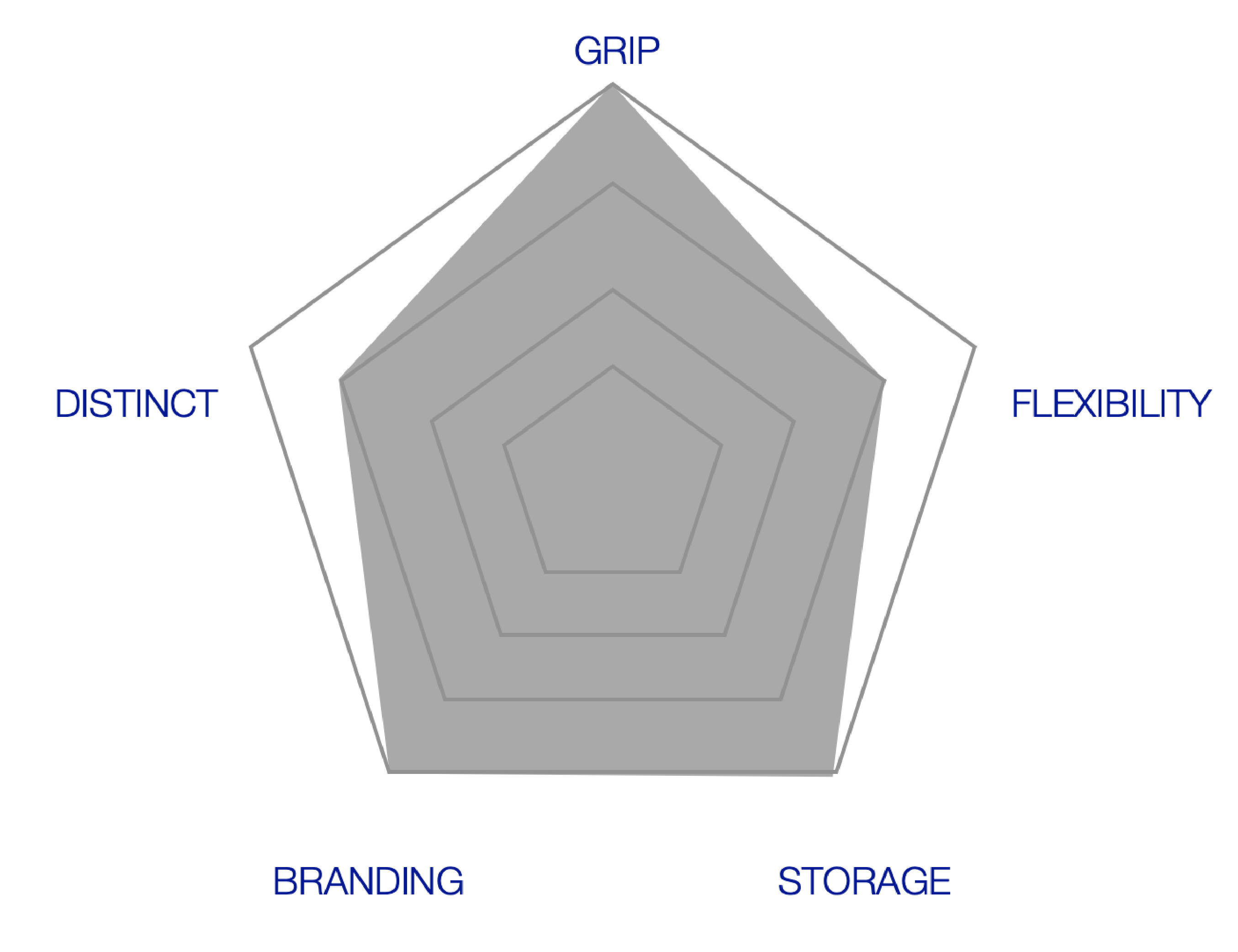

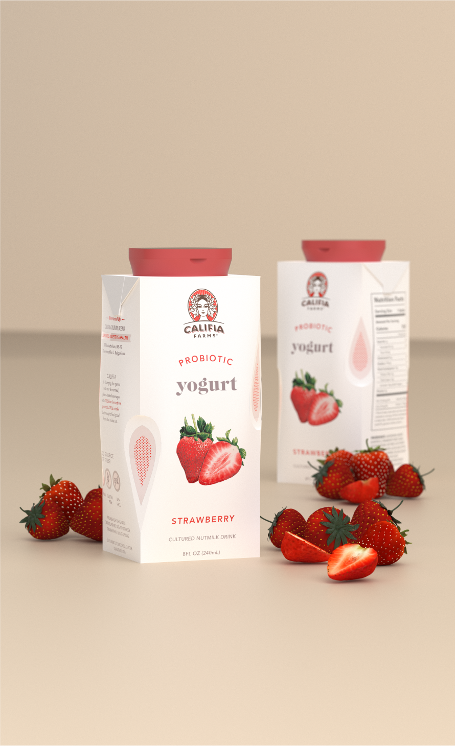
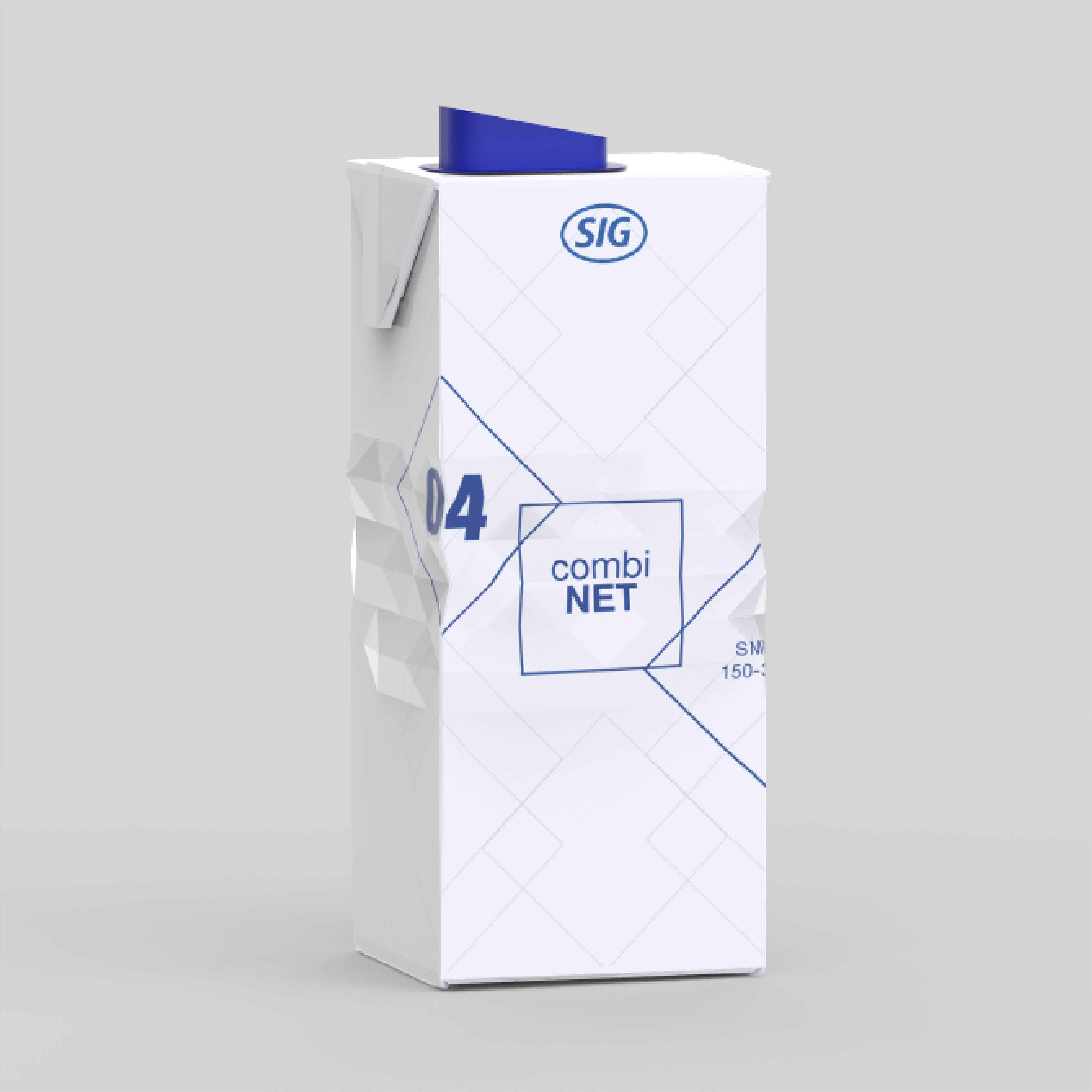
COMBI NET
Designed for a subtle 3D graphic effect while maintaining basic form to maximize efficient storage.
![]()
![]()
![]()
Designed for a subtle 3D graphic effect while maintaining basic form to maximize efficient storage.


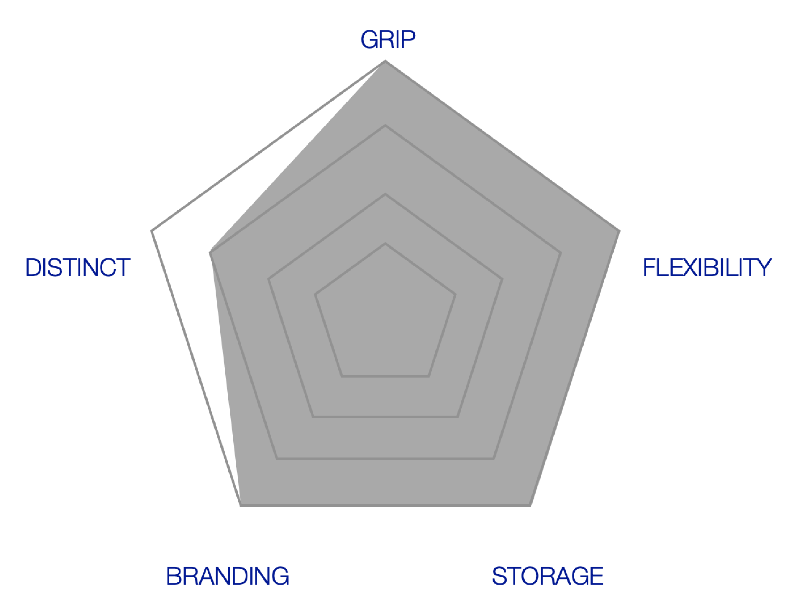
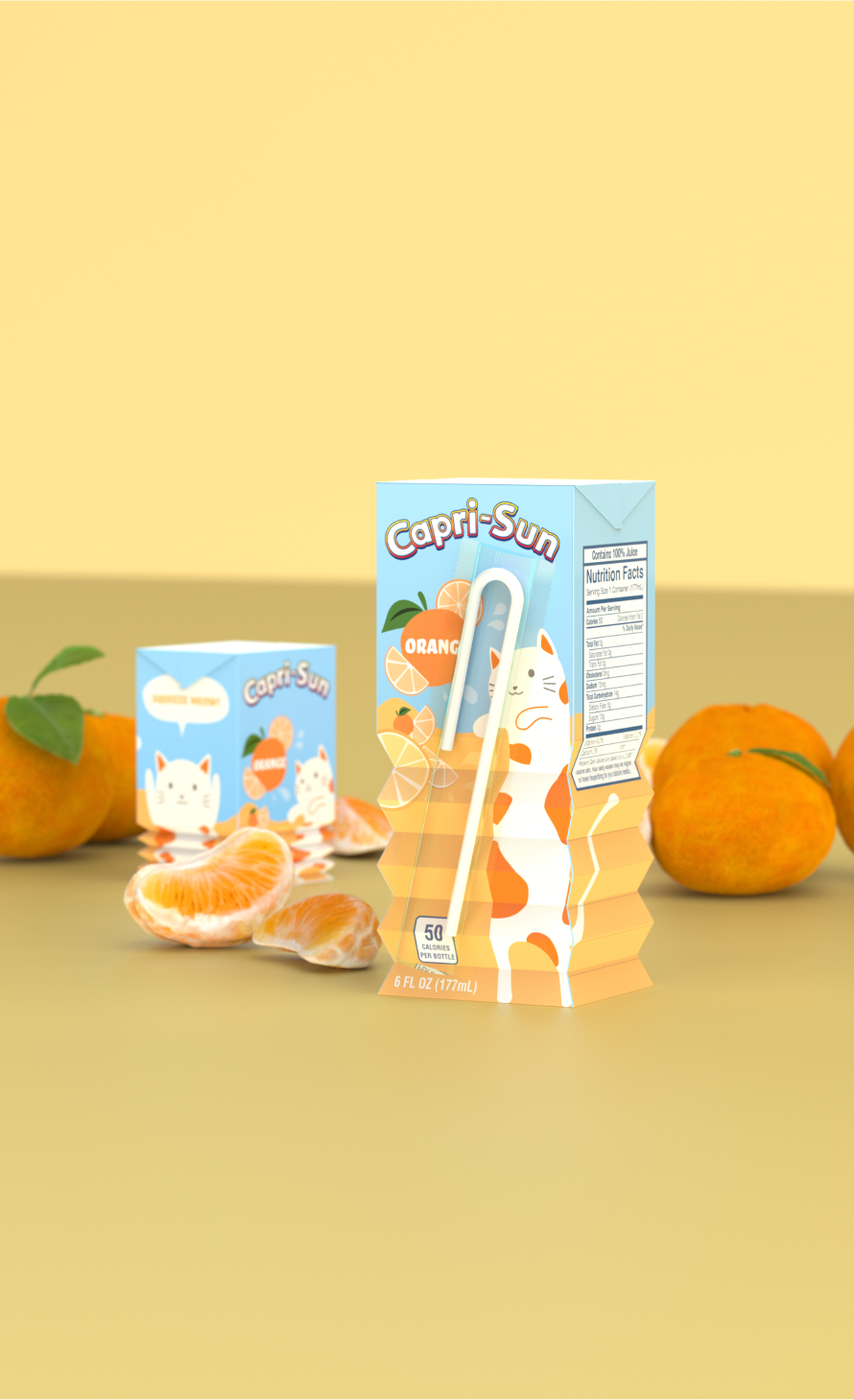
COMBI GRIP
Designed with interactive feature that can widen the branding opportunity while enhancing the grip of package.
![]()
![]()
![]()
Designed with interactive feature that can widen the branding opportunity while enhancing the grip of package.

COMBI CURVE
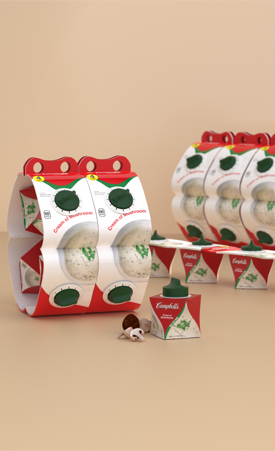
Designed for comfortable grip. Perfect for product that requires heating like soup and hot chocolate.
![]()
![]()
![]()
Designed for comfortable grip. Perfect for product that requires heating like soup and hot chocolate.


MULTIPACKS
Offers a more sustainable alternative using paper-board. For efficient storage purpose, the multipacks must be easy to open and transport around while providing branding opportunity.

MULTI BAR
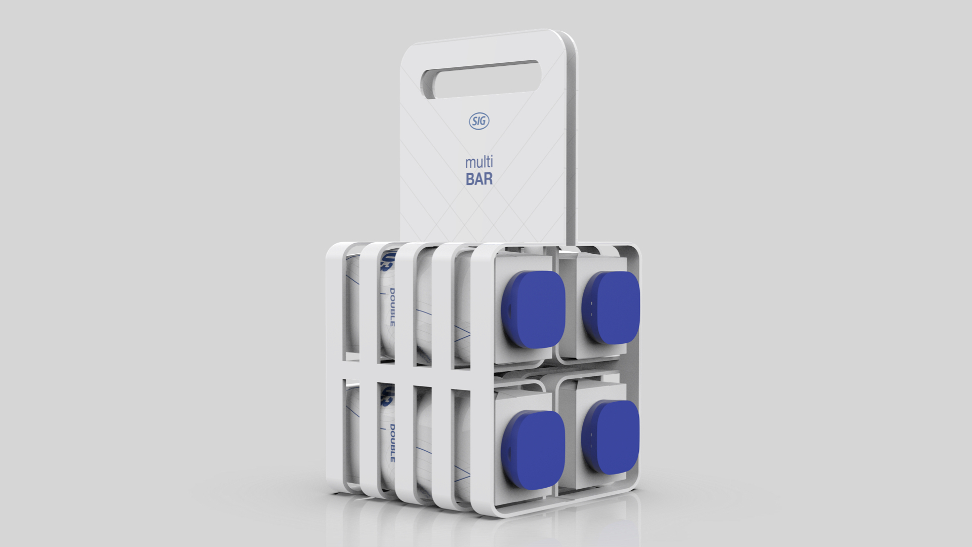
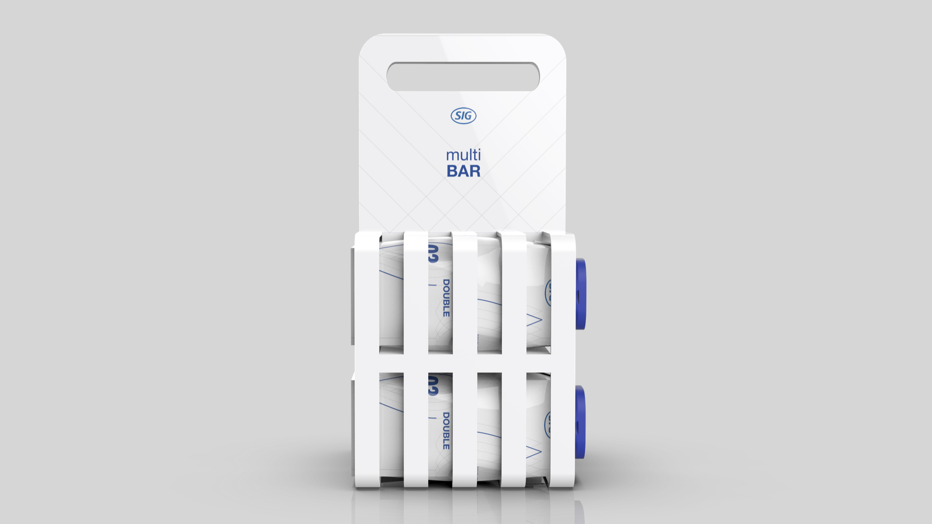
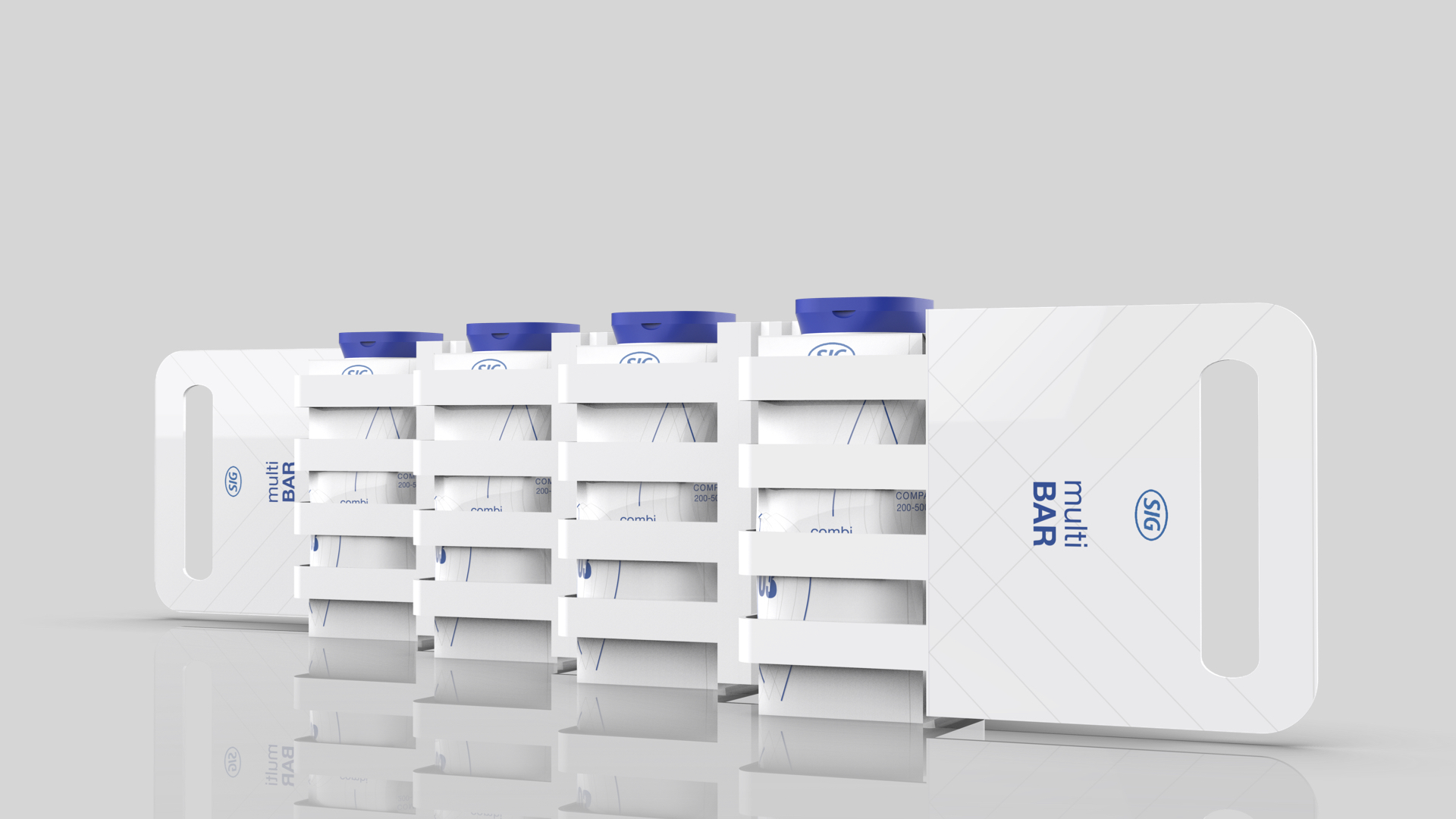
Designed using only a sheet of cardboard to reduce amount of material waste and give a more efficient form.
Compatible with Combi Net, Combi Double and Combi Grip.
![]()
Designed using only a sheet of cardboard to reduce amount of material waste and give a more efficient form.
Compatible with Combi Net, Combi Double and Combi Grip.

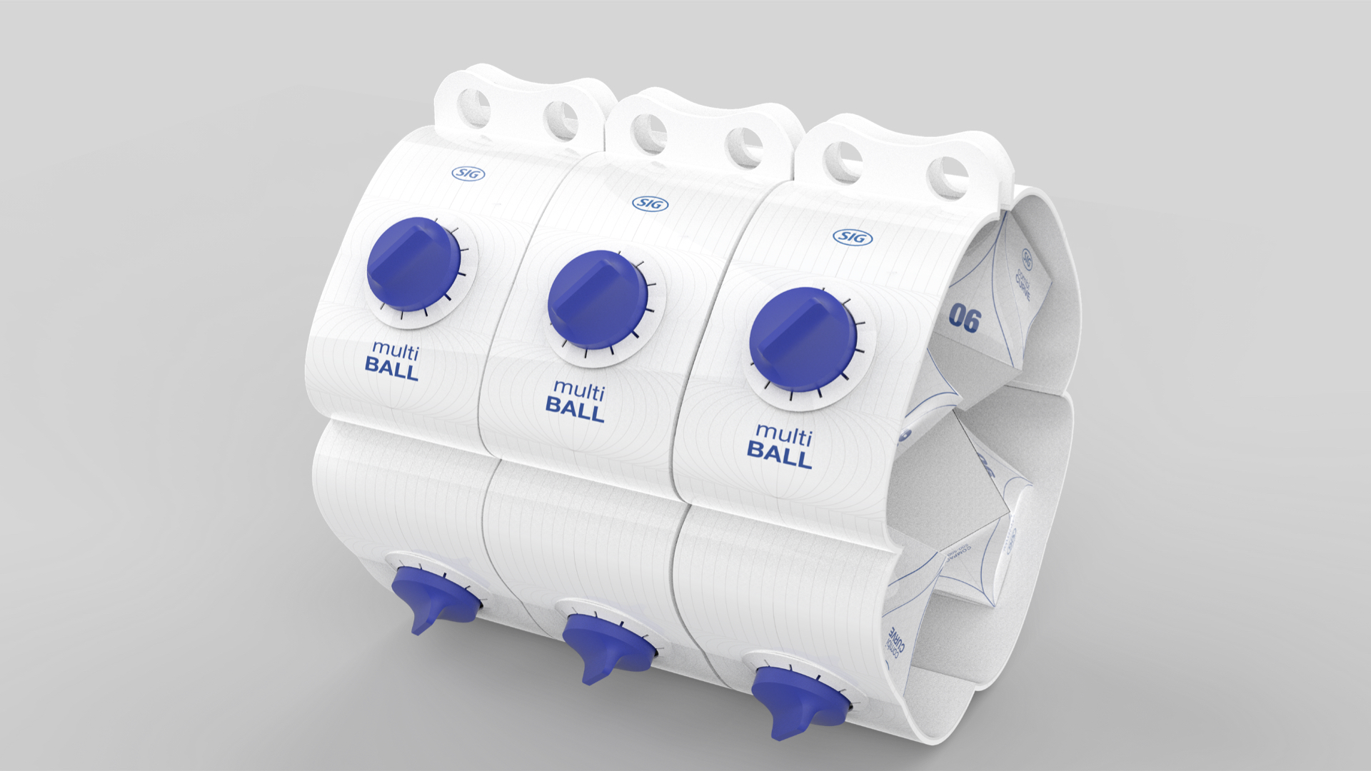
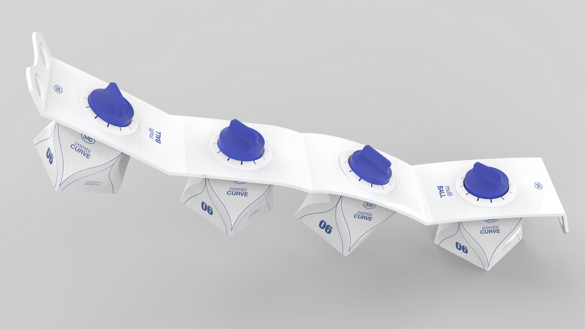
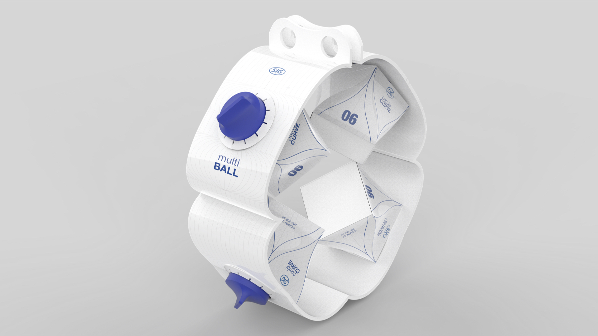
MULTI BALL
Designed for unique shelf impact and reduce material waste by only using one sheet of cardboard.
Compatible with Combi Curve.
![]()
Designed for unique shelf impact and reduce material waste by only using one sheet of cardboard.
Compatible with Combi Curve.

MULTI BOARD
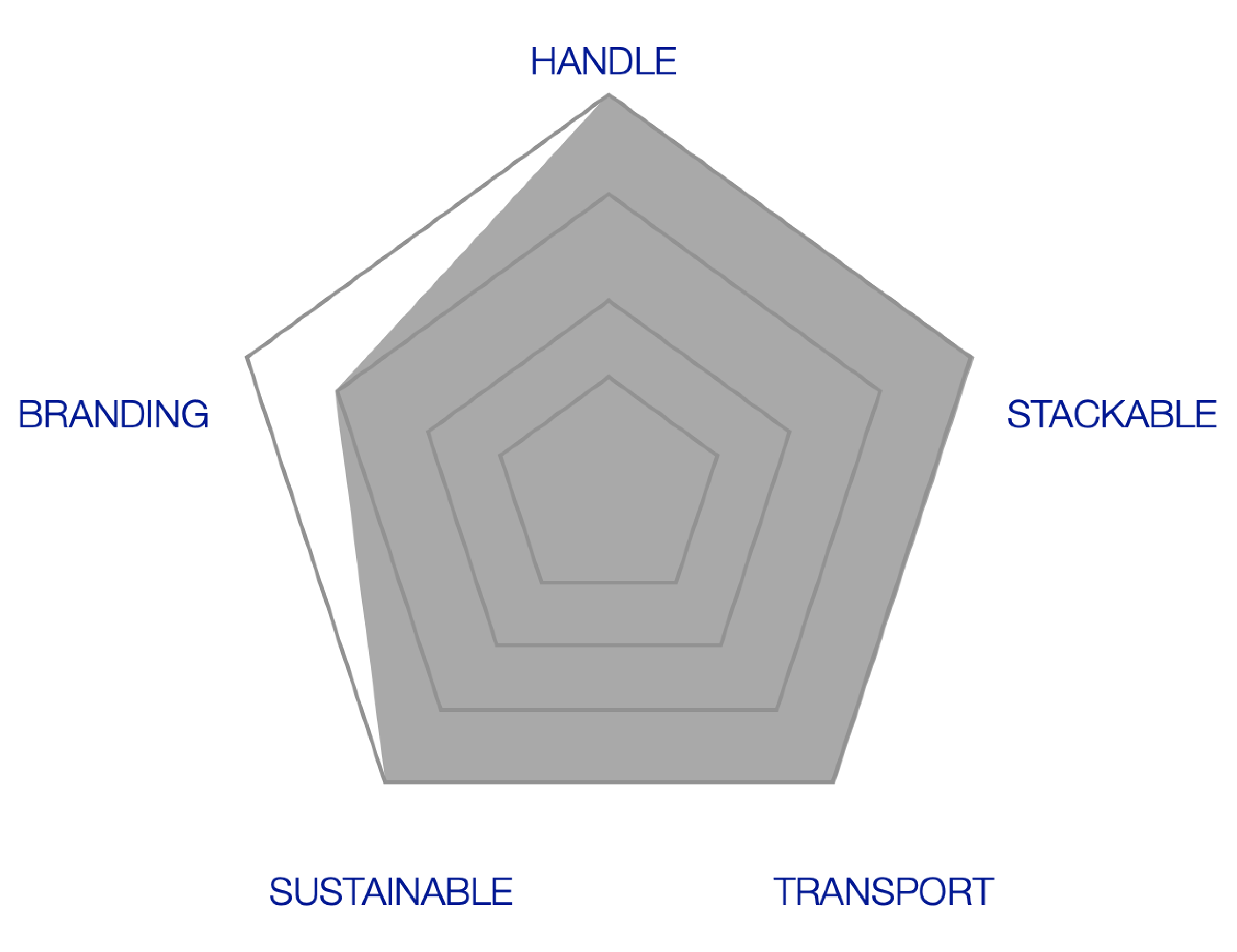
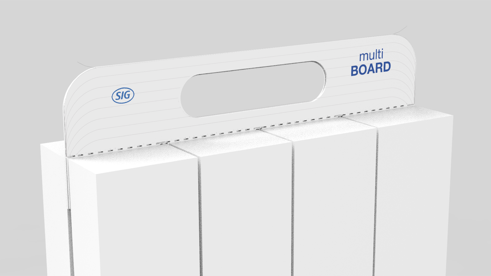
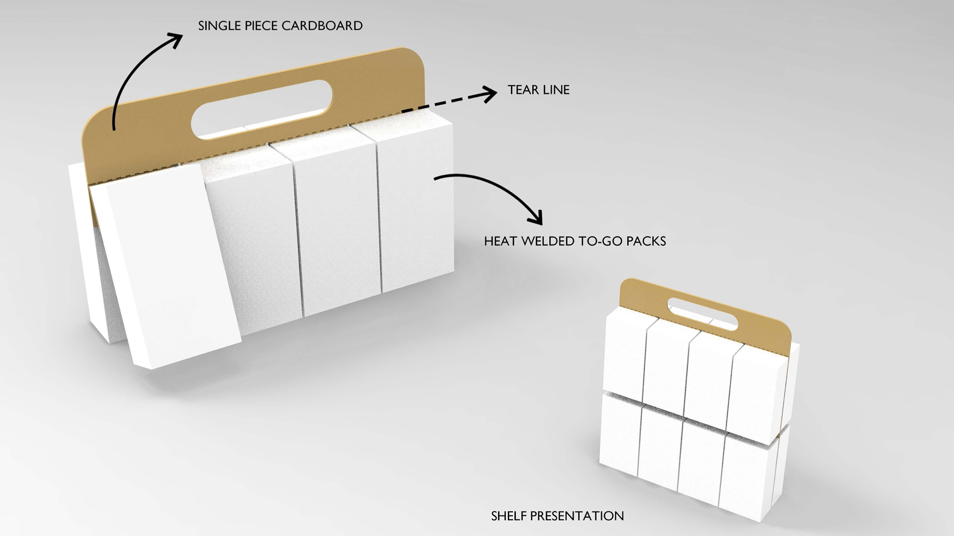
Designed with the leaste amount of material, relying on the plastic layer of the aseptic packaging to bring the products together. Engineered to stack and transport efficiently.
Compatible with Combi Net and Combi Grip.
![]()
Designed with the leaste amount of material, relying on the plastic layer of the aseptic packaging to bring the products together. Engineered to stack and transport efficiently.
Compatible with Combi Net and Combi Grip.
